Case Study: Increasing checkout conversion by 25%.

While managing campusbookrentals.com, I knew the checkout process was crucial. A smooth experience meant more completed transactions, while a clunky one would leave potential customers frustrated and abandoning their carts. Yet, despite a well-performing website, we noticed an alarming trend—our shopping cart drop-off rates were hovering between 30-40%. That meant nearly half of potential customers were walking away at the very last step. It was clear: something had to change.

Identifying the Problem
We dug into the data, heatmaps, and user behavior analytics to see where things were going wrong. A few key pain points emerged:
-
Shipping Costs Were a Psychological Barrier – Customers didn’t like seeing additional fees tacked on at checkout.
-
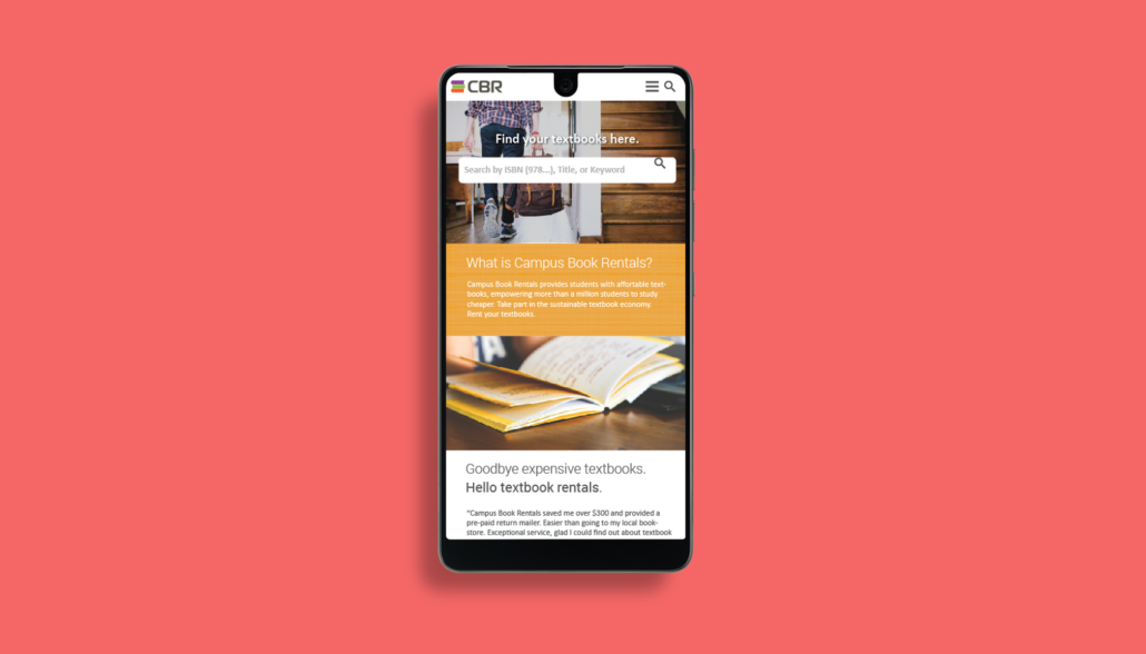
Mobile Experience Was Lacking – A growing number of users were shopping on their phones, but the cart wasn’t optimized for smaller screens.
-
Too Many Checkout Steps – Six steps was too long and gave customers too many chances to reconsider their purchase.
-
Login Friction – Many users were annoyed by the requirement to manually enter all their details before checking out.
Armed with these insights, we developed a hypothesis: If we could streamline the checkout process while making pricing more transparent, we could significantly increase conversions.
The Experimentation Process
We structured our redesign process around four key changes:
1. Bundling Shipping Costs into the Rental Price
One of the biggest pain points for customers was seeing an added shipping cost right before finalizing their order. Our solution? Include the cost of shipping within the price of the textbook rental itself. This way, when customers got to checkout, the total price remained consistent with what they had seen earlier. In A/B tests, customers responded positively to this “free shipping” model, and bounce rates decreased.
2. Mobile Optimization
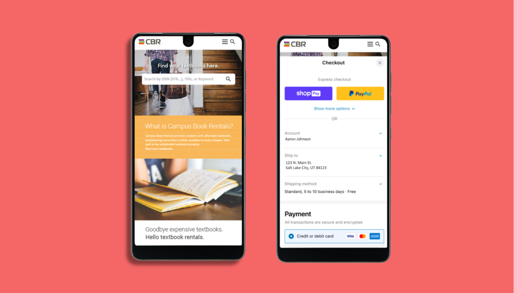
With mobile traffic increasing, our non-optimized checkout was leading to high drop-offs. We redesigned the interface with a mobile-first approach, including:
-
Larger buttons and touch-friendly navigation
-
A simplified layout with minimal distractions
-
Auto-fill capabilities to reduce manual entry
Testing showed that mobile users were far more likely to complete their checkout with these optimizations in place.
3. Reducing Checkout Steps from Six to Three
Our six-step checkout process was exhausting customers before they could even complete their order. By condensing six steps into three—(1) account/login, (2) shipping & payment, (3) order review—we eliminated unnecessary friction.
This change alone had a major impact, reducing time-to-checkout significantly and keeping users engaged.
4. Implementing Google and Facebook Login
Another bottleneck was account creation. Many customers abandoned their cart when they had to enter their details manually. By integrating Google and Facebook login, we allowed users to sign in with a single click. Not only did this reduce friction, but it also increased trust, as customers were more familiar with these platforms.
The Results
After implementing these four major changes, the impact was immediate:
-
Cart abandonment dropped significantly from 30-40% to a much healthier rate.
-
Checkouts increased by 25%, meaning more revenue with the same traffic.
-
Customer satisfaction improved, with fewer complaints about checkout frustrations.
Lessons Learned
This experience reinforced several key lessons in product optimization:
-
Transparency in Pricing Matters – Hidden fees kill conversions. Customers want to know the total cost upfront.
-
Simpler is Always Better – The fewer hoops customers have to jump through, the more likely they are to complete their purchase.
-
Mobile Optimization is Non-Negotiable – As mobile traffic grows, optimizing for small screens is a must.
-
Leverage Existing Platforms for Speed – Google and Facebook logins reduced friction and increased conversion rates.
Final Thoughts
This checkout redesign was a game-changer for Campus Book Rentals, demonstrating how even small changes can have massive impacts. If you’re dealing with high cart abandonment rates, start by analyzing your user experience. Identify the friction points, experiment with solutions, and iterate quickly. In the end, the best experience is the one that gets customers from A to B with minimal resistance.

